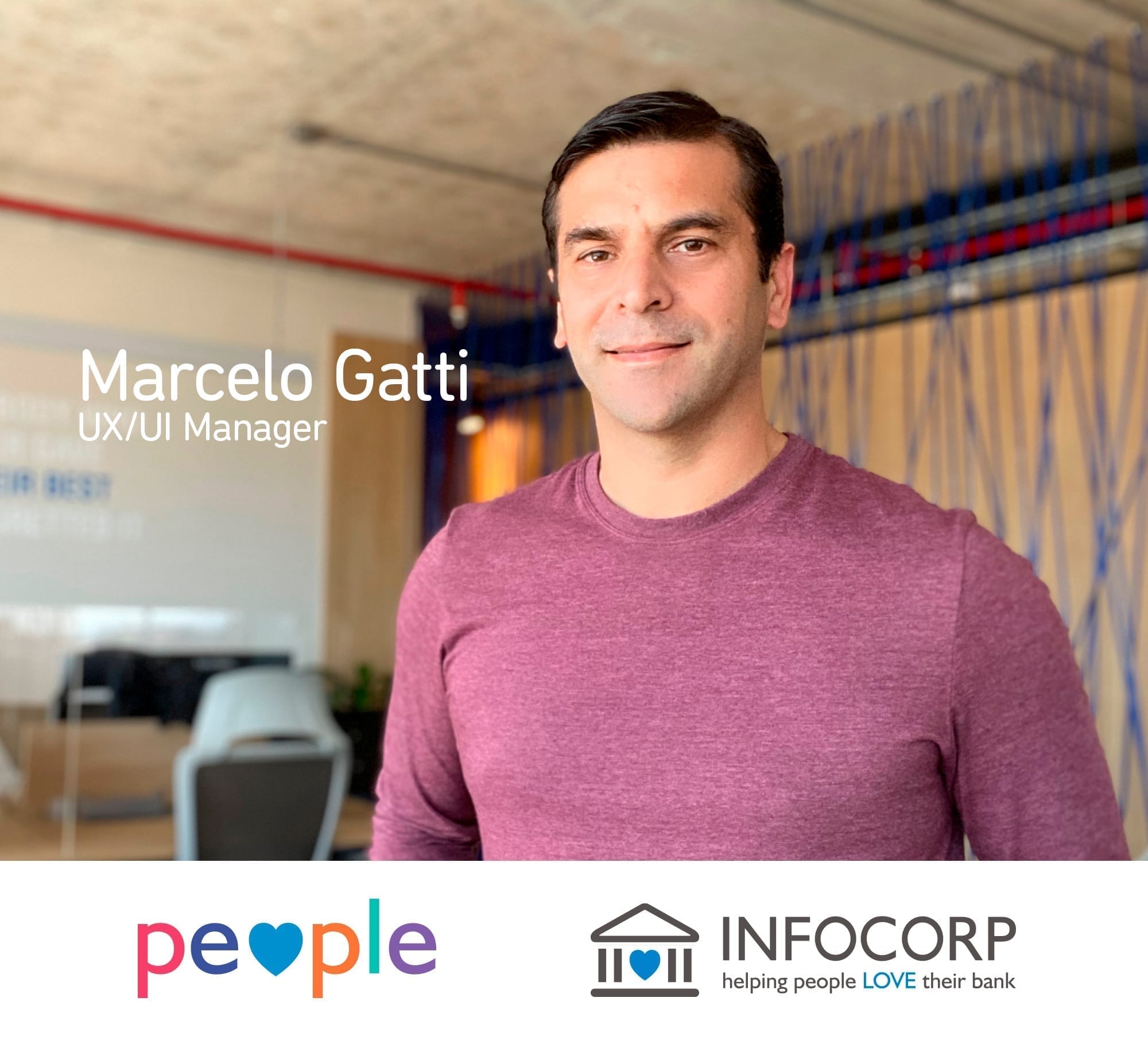
Marcelo Gatti joined Infocorp as a graphic designer, and from then on 17 years have passed! At first, he did everything: Sales material, brochures, websites. He now leads the UX/UI team, participating in all the product creation phases, from ideas to interfaces, going through everything comprised by UX and UI. He is proud to see how products and apps designed by his team are used by millions of people, making them love their banks.
Tell us about your job in Infocorp.
I started in Infocorp 17 years ago. I joined the team in 2003 as the only designer. I had to do everything… I design interfaces, do mock-ups in HTML, and even work in the marketing department creating sales material and brochures. But then I specialized in things having to do with interface and usability. Today, I lead a team that takes part in the product creation process, from beginning to end. My team oversees everything related to UX/UI (user experience / user interfaces) design, until the UI implementation. Besides meeting with customers, I work a lot with project heads to coordinate tasks with the teams, and with analysts to define requirements and features. I also work with the marketing department, regarding Infocorp branding, and sometimes with the HR team.
How is Infocorp’s design team made up today?
We are a team of UX/UI designers and front-end developers, and I hire supplier companies whenever the job demand so requires it. Being a multidisciplinary team, we all exchange ideas and contribute to all projects.
Tell us about your training. How did you learn about UX?
I studied architecture until the fourth year, I even took the architecture trip, and then I began studying Graphic Design at the ORT. At some point, I was in both careers at the same time, but when I returned from that trip, I had to make a choice. So, I decided to get my degree and, in parallel, I started working in design, which was what I liked the most. The career included multimedia design, and during that subject I became passionate about interfaces, even if they didn’t have all the projection then that they do today. And then I started getting into interface design and user experience, and I have been in that path since then.
How was the evolution of digital channels for banks since you began working as a designer 17 years ago until today?
At that time, when I joined the company, Infocorp didn’t have a defined market niche as it does now, as we are part of the financial industry. Back then, we also worked in the health and insurance industries, among others. But we already had Banco Santander Uruguay among our first customers. And as time passed, other customers came, related to the financial industry, and we got to participate in their evolution. The biggest leap was taken when the use of smartphones got to be more widespread. People started to feel the availability of money transfers at any time, anywhere. Even though we already had the banking website, where people could make transfers and payments, I think that was the biggest breakthrough. As time passed, people didn’t want to go to the offices anymore. They wanted to do everything by themselves, and this feeling escalated this year with the pandemic.
Which project would you say was the most challenging since you started working for Infocorp?
There have been many challenging projects. Besides working here, I traveled several times to do some consulting. For example, I had to go to other countries for two weeks to relieve apps and websites and show mock-ups to costumers. It was very interesting to be there during the whole process, from the first conversation with the customer to the digitization of drawings, but it was very challenging as well. For these trips, I would always take large blocks, pencils and erasers with me and draw in front of the customer to interpret their requirements, and that always had a great impact. After that, the drawings would turn into wireframes, using vector-drawing tools to achieve the final result. And once I had the approved navigation flows, we would add some art, create the mock-ups and present that to the customer. These tasks were completed within a two-week period and as a result, the customer could at least have a tangible product with one or several mock-ups. The product wasn’t finished, but at least it could be seen in images, and costumers really appreciated the whole process.
We have many of these stories… I remember that when the first iPad had just come out, we designed a super complex iPad app for a Chilean bank. I remember it was very challenging, but we still presented a bunch of screens.
And the most recent one?
App X. We got an interdisciplinary team together, and we brainstormed ideas for hours to create the app of the future for banks. We would get on really well, and suddenly we would be angry at each other (laughs 😊) because we were very passionate about what we were doing, and in order to put ideas on paper, we drew screens on the whiteboard to visualize how they would be. And there was also an important challenge: at that time, we started working fully with Adobe XD, which is an app that lets us not only mock-up, but also interact between screens, introduce micro interactions, i.e., generate a much richer experience. You practically had the app running in your cell phone, but it was actually a simulation. I was really proud that I got to work with that team and help bring those ideas to life, which were great, and from there we even built a stand that was about that product in an international event in Miami. You pour your heart into it. It goes beyond work, and when you see it become real, it’s fantastic. That was the main driver for the new app, App 7. Many of the ideas we had then are being considered now, and eventually others will be added.
Infocorp’s claim is “Helping people love their bank.” What do you do at work every day to achieve that?
Well, if I remember correctly, this claim was created in 2012… I designed the company’s logo. When I first heard it, I loved it. It is an expression of what my team and I strive for every day, which is placing the attention on our customers’ customers, the end users. For me, our motto is the perfect summary of what user-centric design means.
And what would you say are today’s trends or main points of user-centric design?
First, you have to understand users and the tasks they are going to perform. Usability, that’s a very important point. Responsiveness is also essential, so interfaces look well in all devices. Accessibility is another factor, and appreciation stands out, which is the way users feel when navigating the interfaces. In one of my presentations, I used a slide at the beginning, which showed a rich and flashy plate of hot food, with a text saying “Users are hungry for a great experience,” and that’s because all users use super cool apps, so we must be at the same level as those apps. On the other hand, to avoid extra friction when using our product, we use the “follow the patterns” principle, i.e., following the patterns of what people use and know, such as social media, and making them feel that they are in comfortable and intuitive environments. Examples of this are using the burger menu, or the tab bar, which are familiar navigation modes for users. There’s a book I like a lot, called “Thinking Fast and Slow” by Daniel Kahneman, that deals with this subject. It basically talks about two mental systems, systems 1 and 2. System 1 is fast, intuitive… For example, if you’re driving and you already know how to drive, you do everything automatically; if you change cars, you won’t have any problems. System 2 is the one in charge of thinking. It’s as if someone told you to drive, but in a car with the gearshift in the roof, or on the left side of the seat. If we take the user out of that zone of familiar patterns, you will get them into system 2, and it will make them uncomfortable. We should try to have users make things without thinking much, making it intuitive for them.
Let’s talk a bit about Marcelo on a more personal level. What are your hobbies? What do you like to do?
I love sports in general. I love watching sports and playing some. It’s a routine for me because it’s also good for my head. As a kid, I was federated in handball. I also played soccer and swam in the ACJ. Then I played basket for years, I still do. Even as a grown up, I ended up being federated in table tennis. And with the pandemic, I started playing tennis, which is a sport I’ve always been a fan of. And I love playing it! On a personal level, I enjoy being with my family, I’m very devoted to my family, I like getting together with my mother, my brother and the family, seeing my nephews and spending as much time as possible with my wife and 12-year old son. I have a group of friends that, given the current situation, I see way less than I’d like.
A place in the world? The ideal place for your vacations?
It’s hard to say. I love traveling, and I was lucky enough to do the architecture trip, as well as work trips. During work trips I would always have an extra weekend for myself, so I remember amazing places I’ve visited, such as Isla Culebra in Puerto Rico, or the mountains in the Chilean mountain chain. Once I went to Panama and through the customer, the Ministry of Economy, they took us to see an indigenous settlement on the other side of Panama City, which is an archipelago in the Caribbean called Guna Yala. The water is warm, it’s amazing! Another place I love, that we have visited several times with my family, is Florianopolis. On the other hand, last year my wife, my son and I went to New York, which is a dazzling city. We walked 13 to 15 km every day. My 11-year old at the time and was amazed, it’s an incredible city.
Tell me a bit about the perspective of a person joining Infocorp today.
The things I like the most about Infocorp, thanks to which I’m here today, are its dynamism and capability to adapt. It is a company that has never stayed in the same place, it has always entered different target niches, seizing possibilities, until it found the financial industry. This company has always moved very fast, and I have always learned from it. We invest a lot of money in product creation. That puts a lot of pressure on me, because interfaces are one of the most important parts of products, without a doubt. It’s also very challenging.
I remember that when we created the Banking web product, we started doing a mock-up, thinking about it, we made some demos, salespeople went and sold it, and four projects were simultaneously sold with a PPT. That’s the great part about my job at Infocorp: you always change, you’re always in different stuff, and that doesn’t let you get bored, ever.
